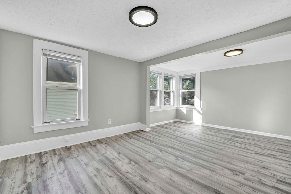
Two apartments with the same paint can look completely different depending on which way their windows face. A grey that looks elegant in a south-facing living room may seem dull and cold in a north-facing bedroom. Before deciding on a color, it is worth understanding what type of light actually enters each room, because that light determines how the final tone will look on the wall, not the paint sample or a photo from a design magazine.
Why orientation changes how we see color
Natural light is not the same on all facades
A Spanish interior architect sums it up clearly: painting a north-facing room, where light is usually cooler and scarce, is not the same as painting a south-facing living room, where the sun intensifies tones. In a home with a south-facing orientation, especially in Spain, there is usually much more natural light entering during much of the day, which makes colors appear generally warmer and more vibrant.
In contrast, north-facing rooms receive much more uniform but also cooler light, which makes colors lose intensity and tend to look dull if not properly compensated.
The mistake of painting everything white to gain light
Many people think white is always the safest option to brighten an apartment, but this is not true in all cases. As another expert consulted by specialized media explains, one of the most common mistakes is choosing white thinking it always brings luminosity and spaciousness, and this is a mistake. In a room with little natural light, a cold white can actually emphasize the sense of greyness rather than correct it.
What colors work according to each orientation
North-facing apartments: cool and constant light
Rooms that face north receive very uniform light throughout the day, but with a cool quality that is worth counteracting. A renovation expert recommends for these homes choosing warm colors such as off-whites, sand tones or soft greys1 that compensate for that coolness in the light. These are also the rooms where soft earth tones that are gaining prominence this season work best.
South-facing apartments: abundant light almost all day
The challenge here is different: with so much light coming in, intense colors can become oversaturated and look even darker than expected at dusk. In these rooms there is more room to try deeper tones, botanical greens or soft blues, without fear that the space will look dull.
East and west-facing apartments: light that changes throughout the day
East-facing orientations receive intense light in the morning and are in shade in the afternoon, while west-facing orientations work the opposite way. In both cases, it is wise to choose a color that looks good both in direct light and in shade, avoiding overly saturated tones that change significantly between morning and night.
How to adapt your palette to your city and climate
Orientation does not act alone: the climate of each region also influences how a color is perceived during the year. In Mediterranean coastal cities like Valencia, Alicante or Málaga, light is intense almost year-round, which favors tones inspired by the sea and earth. In contrast, in inland areas with longer winters, like Madrid, Zaragoza or Burgos, warm tones help spaces feel welcoming even in months with fewer daylight hours.
Here are some quick references by region:
- Mediterranean coast (Valencia, Alicante, Málaga, Barcelona): soft blues, sage greens and warm whites that harmonize with the natural brightness of the area.
- Inland areas with cold winters (Madrid, Zaragoza, Burgos): earth tones, sand and soft terracotta that bring visual warmth.
- Northern areas with fewer daylight hours (Galicia, Asturias, Basque Country): warm neutrals and off-whites that prevent spaces from looking dull.
- South and very warm inland (Seville, Córdoba, Murcia): fresh and light colors in very sunny rooms, reserving intense tones for walls with less direct exposure.
Reference table: orientation, light and recommended color
| Orientation | Type of light | Colors that work best |
|---|---|---|
| North | Cool, uniform, no direct sun | Off-whites, sand tones, soft earth tones |
| South | Intense, direct almost all day | Botanical greens, soft blues, deeper tones |
| East | Strong light in morning, shade in afternoon | Versatile neutrals that do not change much in appearance |
| West | Shade in morning, warm light at dusk | Warm tones that are enhanced by afternoon light |
Before painting: how to confirm the color works in your apartment
No color palette works the same on a screen as it does on the real wall of a living room. For this reason, before deciding on the final tone it is worth applying a sample directly on the wall you want to paint and observing it at different times of the day, with natural light and with artificial light on.
Some practical steps that help avoid surprises:
- Paint a sample square of at least 50x50 cm on the wall, not on a piece of cardboard.
- Observe the color in the morning, at noon and at dusk, with the lights in the house turned on.
- Repeat the same exercise on the wall least favored by light, not just on the most luminous one.
- Take into account the finish chosen: the matte, satin or gloss finish2 also changes how light bounces off the color.
If the work includes walls with imperfections visible under raking light, especially in living rooms facing south where the sun enters at a low angle in the afternoon, it may be a good time to also review the condition of the wall smoothing3 before applying the final color, since intense side light tends to highlight any surface irregularity.
When requesting a quote to paint the interior of an apartment, it is worth remembering that a price calculated only by square meters is always preliminary: two living rooms of the same size may need very different work if one has cracks or humidity and the other does not. The final price can only be confirmed after the professional has seen the real condition of the surfaces, whether through photos and videos or an in-person visit - both options work equally well. On our platform we always request photos and videos of the walls before closing any quote, precisely to avoid surprises mid-project. For those looking for additional color ideas by type of space, our guide on how to choose paint colors and finishes for your apartment4 complements this orientation-focused approach.
Frequently Asked Questions
In living rooms without direct sun, warm tones such as off-whites, sand or soft beige work better, as they compensate for the coolness of the light. It is advisable to avoid very cool greys or intense blues, as they can accentuate the feeling of darkness in these rooms.
Yes, but it is best to do so in moderation and on specific surfaces, such as an accent wall, rather than the entire room. A dark color in a room with little natural light can work if the rest of the decoration provides contrast and good artificial lighting.
Yes, the finish influences how light bounces off the wall. In rooms with little natural light, somewhat more satin finishes help reflect artificial light better, while in very bright rooms a matte finish usually disguises imperfections better.
It is not recommended, because the same color can look very different in each room depending on the light it receives. The usual practice is to maintain a coherent palette but adjust the shade or intensity of the color in each room according to its orientation.
The simplest way is to observe what time of day direct light enters through each window: if it is in the morning, it probably faces east; if it is at dusk, west. You can also check the habitability certificate or ask the homeowners association, which usually has this information registered.

Ready to paint?
Get free quotes from verified local painters in minutes. No commitment.
Sources
External sources open in a new tab.