In many Spanish apartments, especially in cities like Madrid, Barcelona, or Valencia, space is at a premium. That's why choosing the color and finish of your paint is not just an aesthetic matter, but a real tool to make each room feel more spacious, brighter, and better utilized. In 2026, a shift toward warmer, organic palettes emotionally connected to nature is taking hold, where buyers seek homes that feel welcoming without dominating the space. Choosing the right color and type of finish makes all the difference between an apartment that feels cramped and one that breathes.
Why color influences how you perceive the size of your apartment
Colors do more than decorate; they completely change how we perceive space. Shades like white, beige, light gray, or soft blue reflect light better and create a sense of openness, which is especially crucial in small spaces. In apartments with low ceilings or narrow rooms, a light color on the walls helps natural light bounce and spread better, visually expanding every square meter.
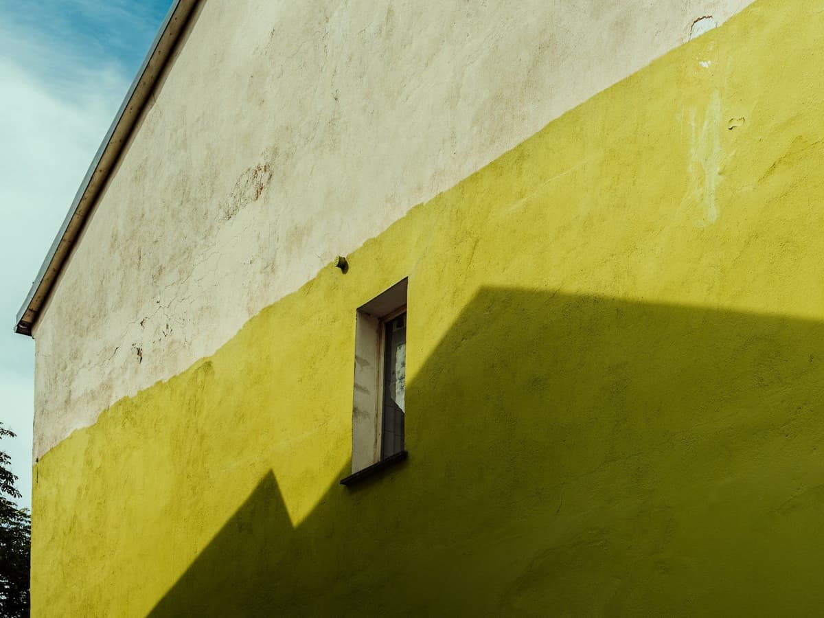
Dark tones, on the other hand, absorb light and can make a small room feel more closed in. This doesn't mean you should avoid them entirely, but they should be used carefully: an accent wall in olive green or terracotta can add character without reducing the sense of space, as long as the remaining walls stay in a more neutral tone. The trending colors for 2026 aren't meant to be used all over the house at once; the key is to pick a warm neutral like a base for large walls and reserve sage green, terracotta, or blue for one or two accent walls.
Which finish to choose based on the type of room and daily use
Just as important as color is the finish. Matte, satin, and semi-gloss are not just a matter of taste: each has technical properties that affect durability, ease of cleaning, and visual result.
Matte finish
Matte is the most used finish for interiors because it offers a silky feel and hides small wall imperfections well. It's ideal for living rooms and bedrooms, where there is little traffic and low risk of stains. Matte also helps dark colors look more intense and uniform, without reflections that distract. However, it has a downside: it's less washable than satin, so it's not the best choice for high-traffic areas like kitchens or narrow hallways.
Satin finish
Satin is more resistant and easier to clean. It offers great versatility, adding a certain shine to the walls of bedrooms, kitchens, and transitional zones; if there's little natural light, it helps reflect some of it, making better use of what's available. It's the most balanced option for apartments with small children, pets, or lots of daily movement. Satin finish also works well in bathrooms and kitchens, where moisture and splashes are frequent. That said, it tends to show wall irregularities and roller marks more, so it's important to prepare the surface well before painting.
Semi-gloss finish
Semi-gloss is used less on full walls, but is very useful on door frames, baseboards, and interior trim. Its high resistance and ease of cleaning make it perfect for areas that are frequently touched or accumulate dust. In small apartments, a touch of semi-gloss on frames can add luminosity without cluttering the space.
Colors that work in small apartments: warm neutrals and measured accents
The color trend in 2026 is marked by a clear pursuit of visual comfort and naturalness, with softer, less saturated palettes that are easy to integrate into different home styles, offering warmth, a sense of spaciousness, and good response to light1. In practice, this means betting on a base of warm whites, beiges, or soft grays on the main walls, and reserving more expressive tones for an accent wall or for decoration.
Some colors that work especially well in small apartments:
- Warm white (like Cloud Dancer): adds light, space, and a sense of cleanliness without feeling cold. Works in any room.
- Toasted beige or sand: warm, easy to combine with wood, linen, and ceramics. Ideal for living rooms and bedrooms.
- Light gray or warm gray: balanced and modern, pairs with almost any decorative style.
- Sage green: versatile and calming, perfect for an accent wall in the bedroom or study.
- Soft terracotta: adds character without darkening, ideal for a reading corner or behind the bed headboard.
In all cases, it's wise to test the color with a sample before painting the entire wall. The light in each room changes throughout the day, and a color that looks perfect at noon might feel dull in the afternoon.
How to use color room by room in a Spanish apartment
Living room
The living room is usually the largest room and receives the most natural light, but it's also where we spend the most hours. A warm neutral on all four walls provides balance and lets furniture and decor take center stage. If the living room is very bright, an accent wall in sage green or terracotta can add depth without closing off the space. If there's little light, it's better to keep the entire room in light tones.
Bedroom
In bedrooms, go for cool and relaxing tones, like pastel blue or sage green. These tones help create a calm and restful atmosphere. Matte finish works well here because the bedroom isn't a high-traffic area and matte adds a softer visual texture.
Kitchen
In the kitchen, it's wise to prioritize satin finish for its resistance to stains and ease of cleaning. Warm white or light beige are safe options that add brightness and work well with any type of cabinetry. If the kitchen is small, avoid dark colors on the main walls.
Bathroom
Just as in the kitchen, satin is the best option in the bathroom. Light neutral tones help the bathroom feel more spacious and clean. If you want something more personal, pastel blue or a greenish gray can add freshness without cluttering the space.
Hallways
Hallways tend to be narrow and receive little natural light. Warm white or very light beige in satin finish helps reflect artificial light and makes the hallway feel less cramped. Avoid dark or heavily saturated colors in this area.
Common mistakes when choosing color and finish in small apartments
- Using too many different colors: in a small apartment, a coherent palette provides continuity and a sense of order. Three or four well-matched tones are enough.
- Choosing matte for high-traffic areas: matte is beautiful, but impractical in kitchens, bathrooms, or hallways.
- Applying dark colors without measuring light well: a bottle green might look spectacular in a magazine photo, but in a living room with small windows it can make the space feel closed off.
- Not testing before painting: always buy a small sample and paint a section of wall. Let it dry and observe how it changes with natural and artificial light throughout the day.
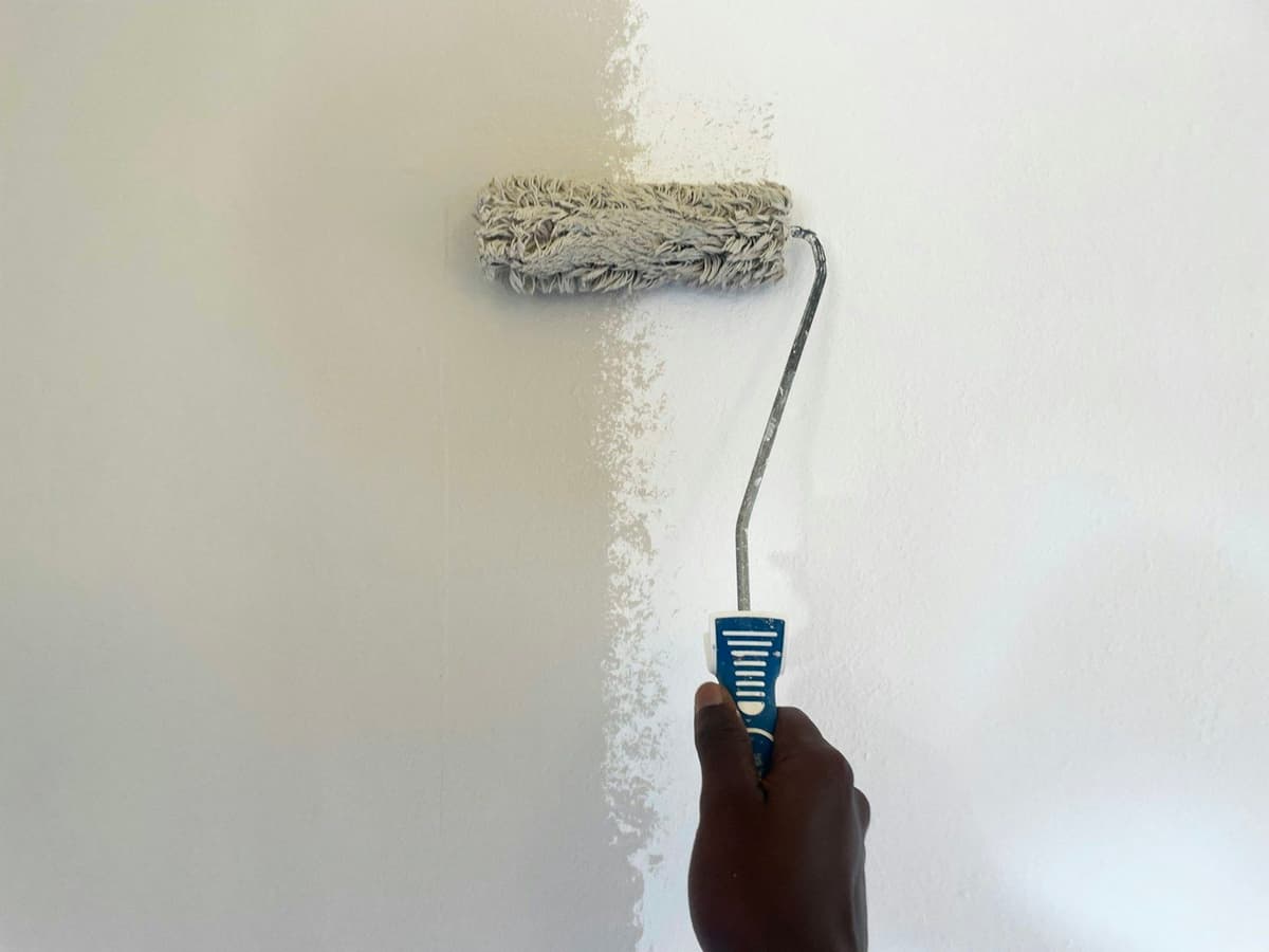
- Ignoring wall condition: satin shows imperfections more than matte. If the wall has small defects, it's better to sand it and apply primer before painting.
How to request a realistic quote for painting your apartment
When requesting a quote, always specify the type of finish you want (matte, satin, or semi-gloss) and the number of coats needed. If the walls are in poor condition, you may need an extra primer coat or prior sanding, and this changes the final price.
Remember that on our platform we always request photos and videos of the surfaces before closing any quote, precisely so the professional can see the real condition of the walls and adjust the price without surprises mid-job. Payment is split into two parts: 50% at the start (to reserve the date and purchase materials) and 50% at the end, after verifying that everything is done well. All job information is recorded in writing and visible to you, the professional, and the platform, so there's no room for misunderstanding.
Next steps: combine well and start with what's most visible
If your apartment is small, start with the living room and hallway: these are the areas most seen and have the biggest visual impact. Choose a base of warm neutrals, a finish appropriate for each room, and if you wish, reserve an accent color for one specific wall. Get samples, do tests, and when you're clear on what you want, request detailed quotes that include paint type, finish, and surface preparation. That way the result will be what you expected, with no surprises.
Sources
External sources open in a new tab.
- Colores tendencia para pintar tu casa en 2026 | Tiendadepinturastiendadepinturas.es