Choosing the color and finish of paint for your apartment is not just an aesthetic matter. Natural light, the size of each room, how you use each space, and the emotional effect you are seeking all determine which color palette and type of finish will work best for your situation.
Color trends for apartments in Spain in 2026
Current trends show a clear shift away from cool grays and pure whites toward warmer, more organic palettes that feel emotionally connected to nature. This shift reflects a desire for homes that are more welcoming, peaceful, and balanced.
Warm neutrals: the safe foundation
Off-whites, soft beiges, sand, and cream tones are evolving toward warmer versions and provide brightness without feeling cold or impersonal1. They are a safe choice for apartments with varying orientations or limited natural light.
Neutrals work especially well in cities like Madrid, Valencia, or Barcelona, where intense Mediterranean light allows you to work with deeper tones without darkening the rooms. In apartments in northern Spain (Bilbao, A Coruña, Gijón), neutrals with warm undertones compensate for fewer hours of sunlight.
Greens, blues, and earth tones: color with personality
Blues, greens, dark grays, burgundy, and terracotta will be trendy in 2026 and 2027, linked to concepts like well-being, comfort, and authenticity2. These deep colors create a sense of enclosure visually and offer a feeling of coziness, but they must be applied carefully.
Experts recommend keeping ceilings white to preserve height and applying deep colors only to selected walls, choosing which wall, which tone, and with what intention.
In cities with hot summers like Seville, Murcia, or Málaga, dusty blues and sage greens provide visual freshness. In cooler inland areas (Castile and León, Aragón), soft terracottas and browns add warmth.
Comparison table: colors by room
| Color | Emotional Effect | Recommended Rooms | Key Combination |
|---|---|---|---|
| Off-white / Warm Beige | Brightness, spaciousness, calm | Living room, hallways, master bedroom | Neutral base + accent in green or terracotta |
| Sage Green | Serenity, balance, nature | Bedroom, home office, bathroom | Green + warm white + light wood |
| Dusty Blue | Calm, freshness, concentration | Bedroom, home office, bathroom | Blue + beige or sand + soft textiles |
| Soft Terracotta | Warmth, authenticity, coziness | Living room (accent wall), dining room, entryway | Terracotta + warm neutrals + black metals |
| Warm Gray (Greige) | Sophistication, neutrality, balance | Living room, hallways, kitchen | Greige + white + wood or copper details |
How natural light and space size influence your choice
Natural light is one of the most important factors: north-facing rooms benefit from warmer colors, while very bright spaces allow more intense tones; room size also matters, as light colors visually enlarge a space and darker colors work better in larger rooms.
Apartments with limited natural light
In interior apartments or those with north-facing windows, warm neutrals (sand beige, cream, cloud white) reflect the limited available light and prevent the space from feeling dull. Avoid cool grays or intense blues, which emphasize lack of light.
Bright apartments with south or east orientation
Mediterranean light allows you to work with more saturated colors without losing a sense of spaciousness. Sage greens, dusty blues, and terracottas gain depth under intense natural light. You can reserve these tones for one or two accent walls.
Low ceilings or small rooms
Light and cool colors visually expand a space. Keep the ceiling white and apply color only to the walls. If the ceiling is low (less than 2.50 m), avoid dark colors on all walls: instead, choose a single accent wall in a deep tone and keep the rest in light neutrals.
Paint finishes: matte, satin, or glossy
The finish determines how the painted surface reflects light and affects both aesthetics and durability.
Matte finish
In 2026 colors are primarily applied in matte or silky finishes, reinforcing the sense of serenity. Matte does not reflect light, hides small wall imperfections, and provides a contemporary and sophisticated appearance.
- Advantages: current look, hides wall irregularities, does not reflect artificial light.
- Disadvantages: less resistant to scuffing and stains, harder to clean.
- Where to use it: bedrooms, living rooms, home offices, hallways with light traffic.
For more details on choosing the right finish by room type, see this specific guide on finishes by room3.
Satin finish
Satin is a middle ground: it reflects light softly, is more washable than matte, and still offers an elegant appearance. It is the most practical option for homes with children or pets.
- Advantages: greater washability, balance between aesthetics and durability, resistant to scuffing.
- Disadvantages: highlights imperfections if the wall is not well prepared.
- Where to use it: kitchens, bathrooms, high-traffic hallways, children's rooms.
Glossy finish
Gloss reflects a lot of light, visually enlarges the space, and is very washable, but highlights any surface defect. Its use in apartments is very limited.
- Advantages: maximum washability, resistance to moisture, spacious effect.
- Disadvantages: highlights every imperfection, can feel cold or unwelcoming.
- Where to use it: doors, frames, furniture, bathroom ceilings (in rare cases).
The role of color psychology in your apartment
Each color generates a specific emotional response, and understanding this effect allows you to design each room according to its function.
Colors for rest and relaxation
In the bedroom it is important to select colors that promote relaxation and rest; soft and calming tones such as light blues, soft greens, and neutral tones are ideal for creating a serene and peaceful environment4. Avoid intense reds, oranges, or bright yellows, which stimulate activity.
Colors for concentration and work
Blue can be used in rooms that require concentration, such as home offices or libraries, as it helps improve focus and productivity. Soft greens also promote balance and reduce stress during long work-from-home days.
Colors for social spaces
Warm neutrals, soft terracottas, and sage greens work well in living rooms and dining rooms: they create welcoming environments without visual overwhelm. If you want more energy, you can add an accent wall in terracotta or burgundy.
Common mistakes when choosing colors and finishes
These are the most frequent errors we see in Spanish apartments:
- Choosing color from a small sample: colors change based on light and surface area. Request a large sample and test it on the wall for several days, observing how it changes with natural and artificial light.
- Using the same finish in all rooms: each space has different needs for washability and light. Reserve matte for bedrooms and satin for high-traffic areas.
- Painting all walls the same deep color: intense tones work better as accents. Keep the rest in neutrals for balance.
- Not considering orientation: a green that works in a south-facing living room may look dull in a north-facing bedroom.
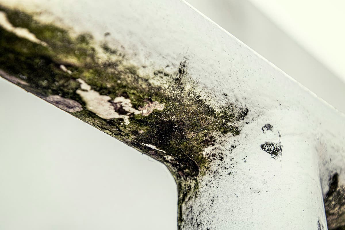
- Forgetting surface preparation: a satin or glossy finish highlights every imperfection. Make sure the wall is smooth, without cracks or moisture, before painting.
If your apartment has visible moisture or wall stains, do not paint directly over them. See how to identify the source of moisture before painting5 to prevent the problem from returning.
What to do before painting: practical steps
Before buying paint or hiring a professional, follow these steps:
- Measure the total surface area to be painted (walls and ceilings). Note measurements by room to calculate the liters needed.
- Observe natural light at different times of day. Note the orientation of each room (north, south, east, west).
- Define the use of each space: rest, work, transit, social gathering. This determines both color and finish.
- Request samples of the colors you are interested in. Apply each sample to a large section of wall (at least 50 x 50 cm) and observe for 2-3 days.
- Check the condition of surfaces: cracks, moisture, peeling paint. These should be repaired before painting.
- Request quotes with photos and videos of the space. On our platform, the professional sees the actual condition of surfaces through the images you send, which allows the quote to be adjusted from the start and avoids surprises.
The quote should reflect the complete work: surface preparation, primer if necessary, number of coats, paint type, and finish. All these details are recorded on the platform, visible to you, the professional, and us.
Frequently Asked Questions
Warm neutrals (sand beige, cream, cloud white) are the best option because they reflect available light and prevent the space from feeling dull. Avoid cool grays or dark colors, which emphasize the lack of light.
It is not recommended. Dark colors visually reduce a space and need plenty of natural light to work well. If you like deep tones, apply them to just one accent wall and keep the rest in light neutrals.
Satin is much more washable than matte and resists scuffing and stains better. If you have children, pets, or high-traffic areas, satin is the most practical option.
Request paint samples and apply each color to a large section of wall (at least 50 x 50 cm). Observe how it changes with natural light throughout the day and artificial light at night. Wait at least 2-3 days before deciding.
It depends on the wall's condition and the color change. If you are painting a very dark color with a light one, or if the wall has repaired stains or moisture, priming is necessary to ensure a uniform finish. The professional should assess this when viewing photos of the space.

Ready to paint?
Get free quotes from verified local painters in minutes. No commitment.
Sources
External sources open in a new tab.
- Colores tendencia para pintar tu casa en 2026tiendadepinturas.es
- Colores para pintar las paredes hasta el año 2027 según dos interioristasrevistainteriores.es
- Cómo elegir acabados de pintura según el tipo de estancia en tu pisomyfixio.es
- Colores para Pintar tu Casa: Guía según la Psicología del Colorbigmat.es
- Cómo identificar el origen de la humedad antes de pintar tu viviendamyfixio.es